“If possible, avoid being a bubble; for a bubble, even the gentlest touch is fatal.”
Fragility is the key word in this project as this is the main connotation relating to the words “bubble” or “bubble wrap”.
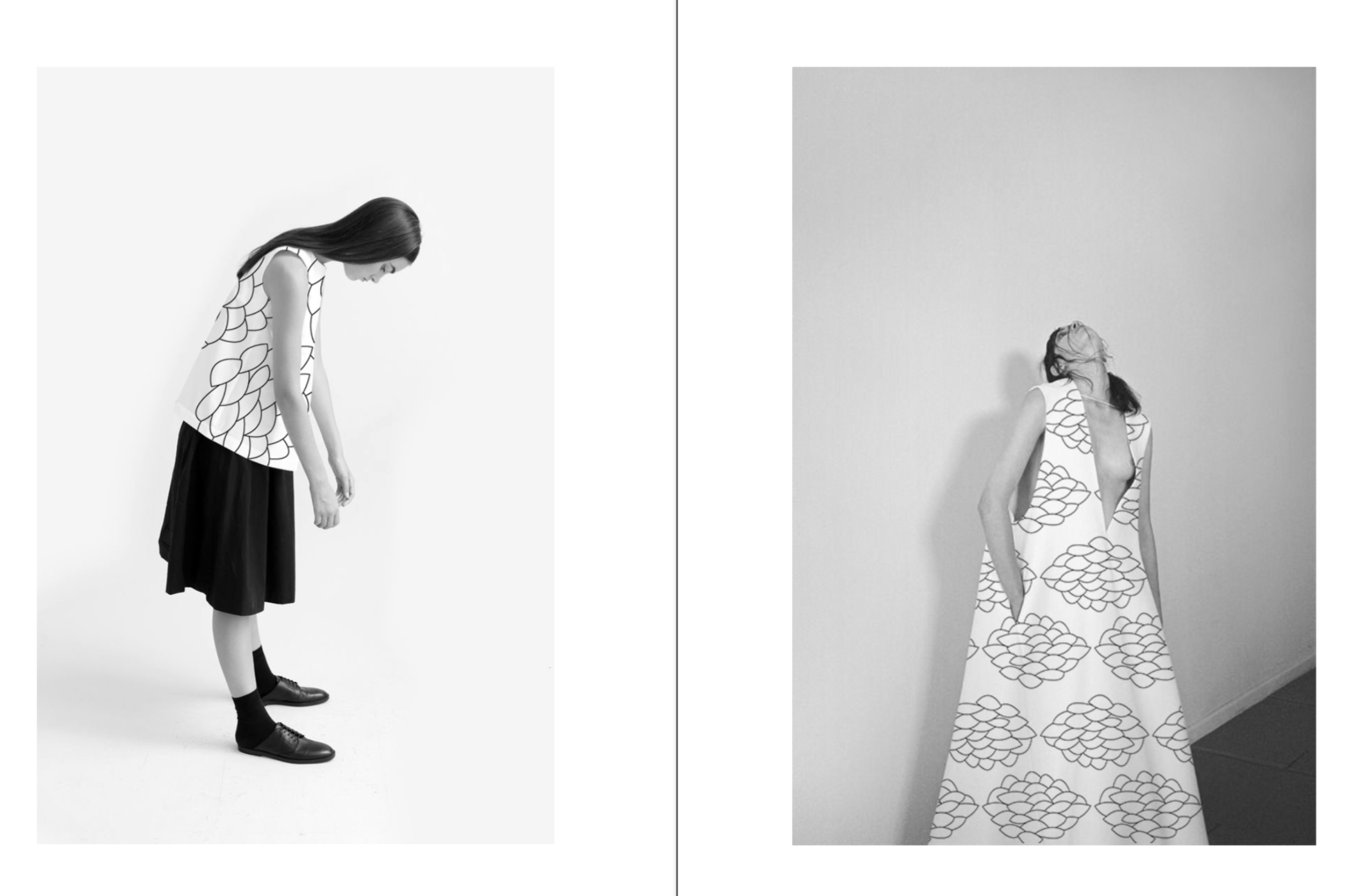
This project playfully experiments with tones of gray as well as black and white as a thematic palette of this fragile state. This color palette choice (or lack thereof) also serves the purpose of projecting the strength and rigidness of the prints. The prints are graphic, noisy and strong and at the same time, fragile. The booklet prepared on the basis of this project uses materials such as glue and bubble wrap to make the project appear more tangible and give it a 3D look.
‘‘Bubble, bubble, flows the stream like an old tune through a dream.”


